Battle.net
App & Landing Page Redesign
Designed by Allison Cassels
Good UI design has little to do with looking pretty. My assignment was to redesign the Battle.net desktop app and landing page, but to truly do them justice, I had to go much deeper than appearance. I needed to analyze every feature of each product to find out what was and wasn't working, and discover new ways to improve usage.
In my exploration, I identified 4 areas with room for drastic improvement...
 Diversify Users' Interest
I want to make people click on more than the Play button. Users open Battle.net to play a game, and for many people, that's their only use for the app. The app has a clean, beautiful UI but features outside the "Play" button don't capture the user's attention enough to make people click. I believe that if we offer more content of personal interest to the users right inside the app and put the links in the user's line of vision, they will begin to use the app in new and diverse ways.
 Personal Relationship Development
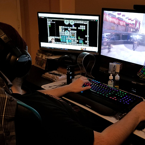
Socialization needs to become a priority again. When my friends and I reminisce about the good ol' days of gaming, the most meaningful memories are about friends. We made lasting friendships that even carried through into real life. This is one of the biggest things Blizzard's games are missing in 2017 -- they don't support friendship-building. This is especially true in Battle.net where the chat is hidden away at all times, behind an icon that doesn't look like a chat icon.
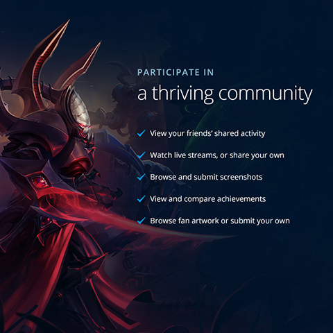
 Fostering Community
If we promote community, it will thrive. Possibly the best thing about Blizzard is the devoted fans. People adore Blizzard and want to tell the whole world, yet there's nothing whatsoever in the Blizzard apps that fosters community development. Let's integrate user-generated content and allow users to share it with friends. Taking advantage of that momentum can only increase loyalty to Blizzard, making it a win-win for everyone.
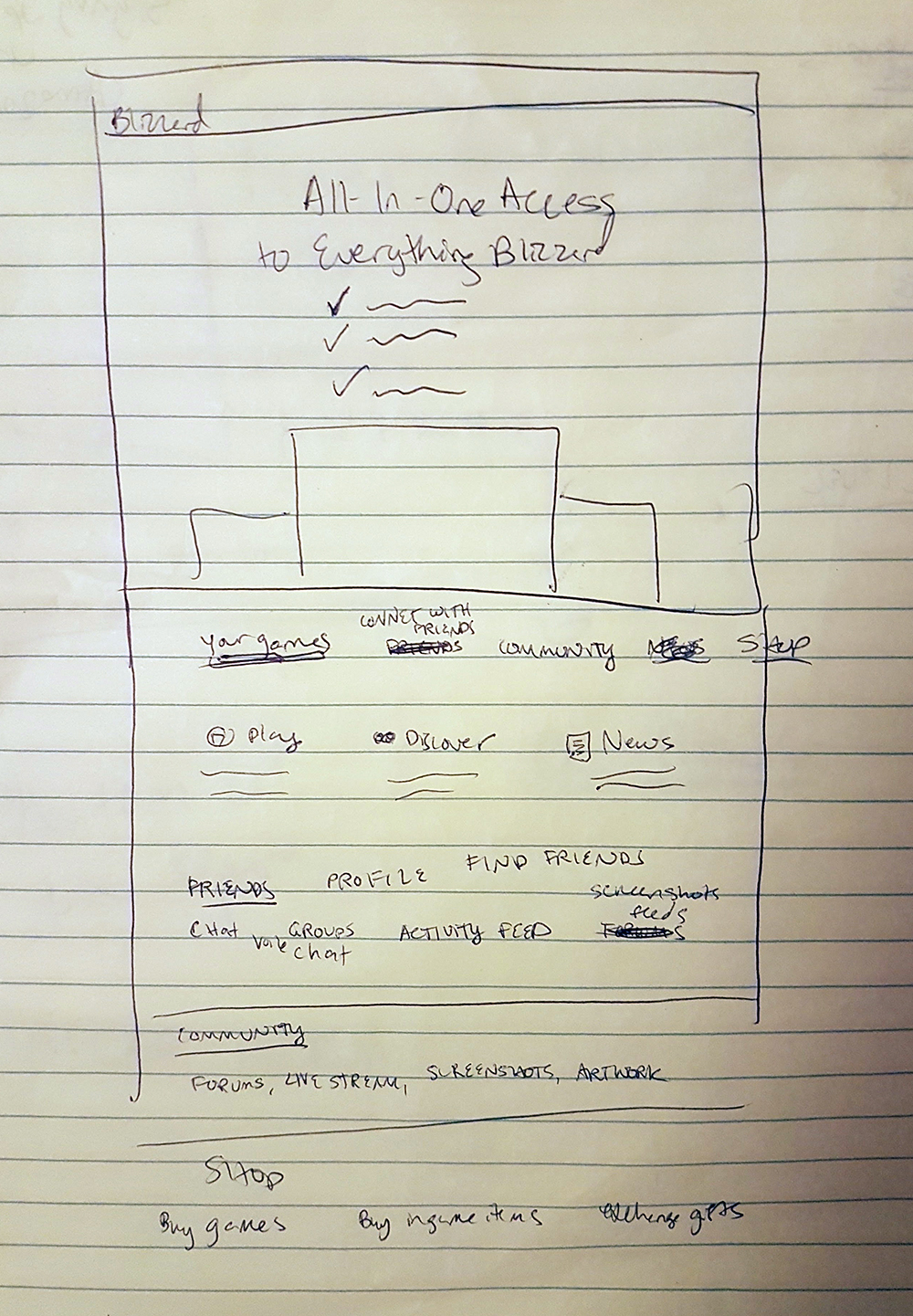
 Full Access to Blizzard in One App
In 2017, people don't need or want to leave the app. There are many links in the current Battle.net that open in your web browser which is inconvenient and not a consistent experience for users. This is completely unnecessary in this day and age -- using websocks or webRTC, we can easily pull in content from the web using lightbox overlays so that users can view everything of interest from one location.
I began with a thorough critique of both products, examining all elements one-by-one. I tried to understand what motivated each decision and what made every feature a "need".
I had already analyzed the app in past and found it to be very well-designed; its obvious that a lot of consideration went into every feature. I didn't feel I had any place to go making a bunch of uninformed changes when the existing design decisions were based on research and experience, so, for the most part, I left the existing features of the app intact. There were, however, a handful of things that I thought could be handled better...
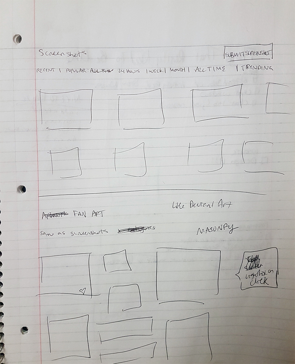
Side-scrolling Content
Since users are usually in the app to play games rather than to look at content, the only way they are going to look at additional content is if it catches their eyes. Data shows that carousel-type content is ineffective and users almost never continue to the next slide. The only time anyone is going to click right on this carousel is if they're bored while waiting for their game to download.
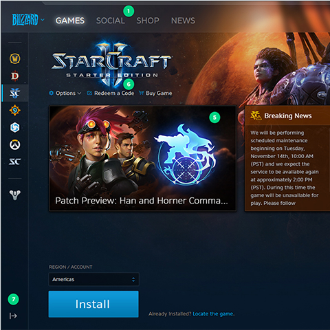
Redeem a Code
I could be misinformed but it seems to me that this has an unnecessarily prominent position. It doesn't seem more important than other things that are stored under menus.
Game List Expand/Collapse
If there was more content in the Battle.net app, I would understand this toggle, but the screen is already quite small and sparse so this toggle just feels like superfluous design.
My comments on the landing page are more general.
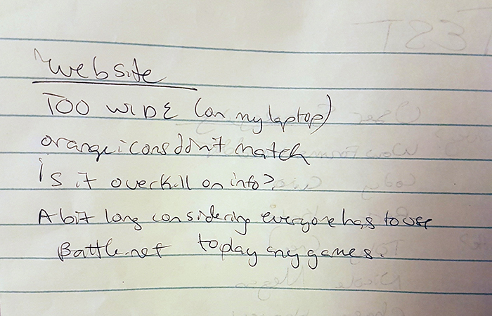
Scale
I know this page was designed to match the rest of the site, but it feels much too large and wide, even on a 27" monitor. The tagline is almost screaming at you and the use of orange throughout the site does not match the app or other Blizzard branding. The yellow section, though attractive, is much too light for the page and is mismatched by its contrast.
Content
Overall, there is way too much content for a page that only needs to communicate simple points. Since users are required to download the app regardless, the chances of them scrolling down and reading through all this are low. If it was shorter and easier to read at a glance it would stand a much better chance.
Since this feature was just released, it seemed almost insulting for me to fully redesign it. I originally planned to just reskin it, but in my quest to fully integrate it into my new design, I came across many ways in which the current design fell short. I redesigned the social tab with aim to remedy these issues.
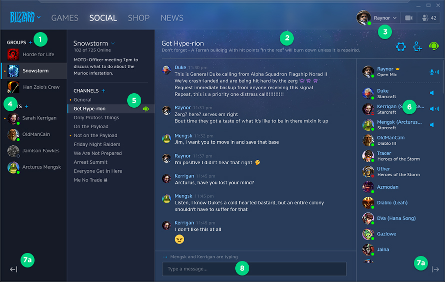
Blue Pluses and Carets
The blue side icons grab too much attention and for some reason feels amateurish.
Channel Description
I don't think this is a good place to put a description. I see the value of having info available but I don't think it needs to be present all the time.
Top Right Icons
These icons are too large and bright.
Orange Dots
These orange dots for notifications are way too small and give you no information.
Green Voice Chat Icon
The green for the active voice feels mismatched from the rest of the app. If green was used more often it might work, but it doesn't here.
Icons on Right Side of Chat
I have no idea what these icons are indicating. Not beneficial in their current form.
Sidebar Expand/Collapse
I see the value in these and I appreciate their usefulness, but they just don't feel intuitive. They're hard to notice and its not immediately clear what they do. I feel like nothing should be included unless its intuitive and you can defend why its needed. I feel neither is the case for these icons so until I can think of a better way of doing these I'm going to remove them.
I continued work on the app so I could show you all of my ideas. Don't worry, the original version is still viewable.
Please view comments on all pages in Invision.
Original App Redesign
1. Critique of App and Website
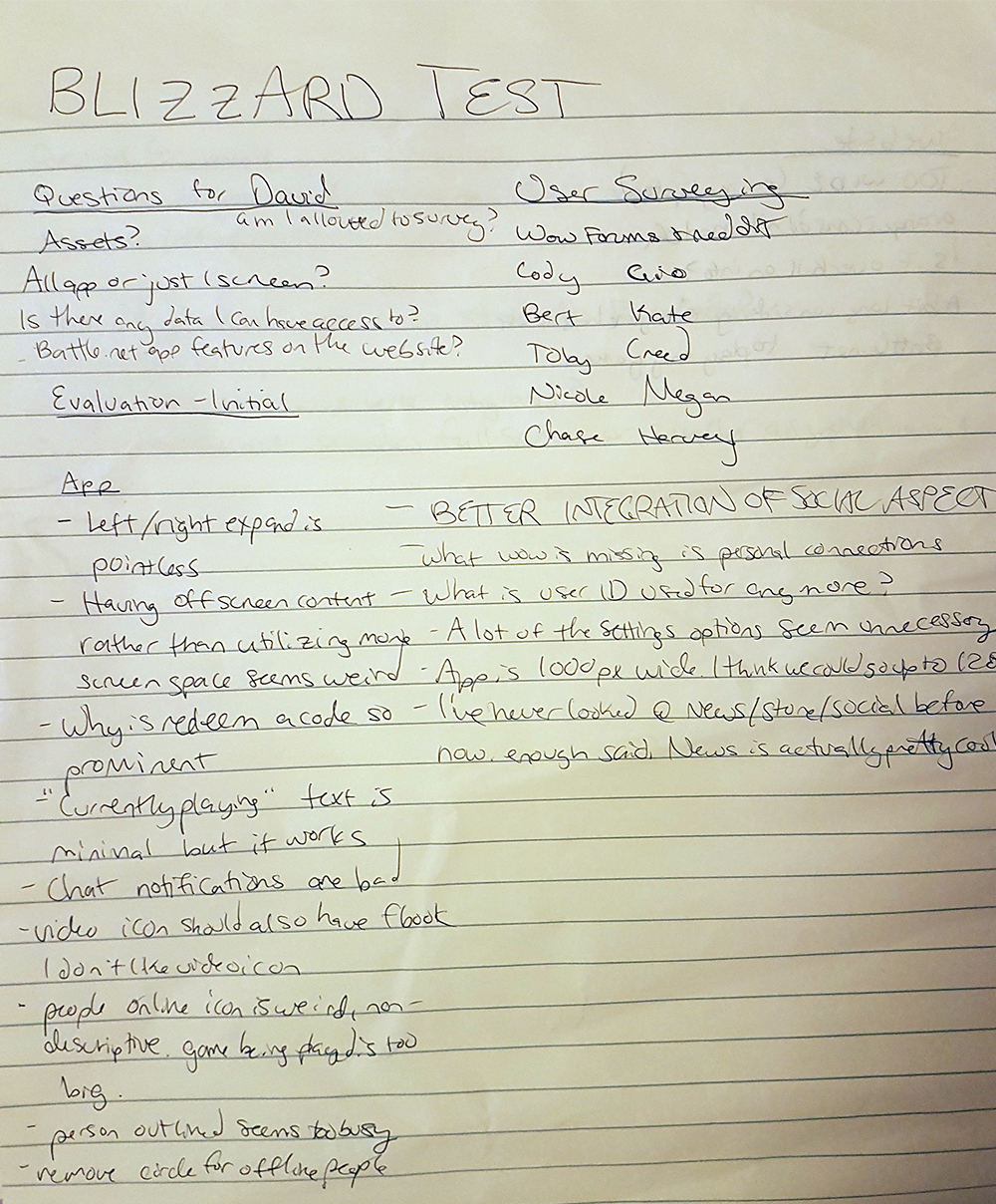
I went through each and thoroughly examined each feature. I tried to understand what motivated each decision and what needs they fulfill. I compiled a list of all of this feedback, including a list of questions which I sent to David.
2. Competitive research
Next I did my first round of competitive research. I critiqued similar apps in the exact same way I did Battle.net, trying to understand why they made the decisions they did, seeing what works for them and what doesn't work, what extra features they include and whether or not people seem to be using them. I also looked at what standards I noticed across the apps to see if there's anything to integrate into Battle.net that would allow easier understanding for users.
I looked to these external sources many times throughout the process as new questions arose.
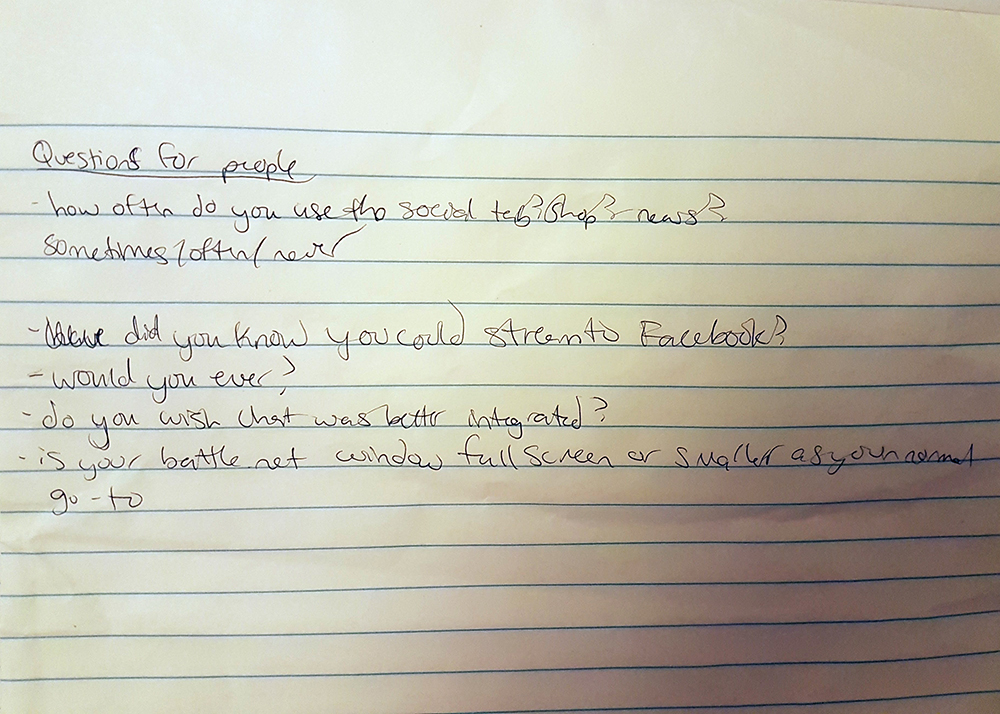
3. Surveying friends
I knew I couldn't redesign the app based on my own opinions, but I had no access to user data so instead I had to poll my friends.
Instead of getting their opinions on what they like and didn't like about Battle.net, I asked them specific questions like, "what do you think this icon does?" "Have you ever clicked on this? If so, how often?" I also asked them about what features they liked on other gaming apps.
4. Reading Blizzard forums
The best way to give fans what they want is just to listen to them, so I went to the Blizzard forums and read through probably 25 pages of comments. Most of the suggestions weren't great but within the mix there were some I saw repeated over and over again, many of which seemed like positive additions, or at the least, not too dangerous. I compiled a list of these and then considered what impact they would have on Blizzard if applied.
Requested features I included:
- Number of how many unread messages, easier way of seeing missed messages
- Ability to hide games, or only show the ones you actually have
- Option to delete/clear chat history
- Add classic games into the launcher
- Reintegration of pop-out chat, or at least the ability to switch between the 2 easily
- Full screen viewing for videos and media
- Twitch and Youtube streaming, not just Facebook
- Organize your friends into groups
- Clear chat history
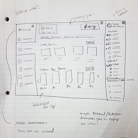
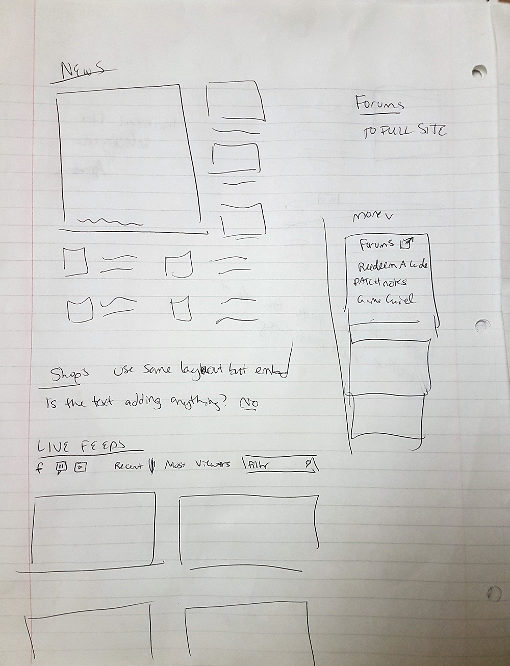
5. Sketching wireframes
After my initial research was complete, I sketched wireframes of every page and section that I designed. I actually sketched less than I usually do because a lot of the layout was predetermined; I needed to preserve placement where I could so that users don't have to relearn how to use the entire app.
6. Mockups
I started with the redesign of the app because I felt that would dictate the look of the landing page.
I'm a PC user so I did all of the design work in Photoshop. I tested hundreds of icons, font sizes, spacing, colors, trying to find the most easy-to-digest solutions, and to find balance between the different sections
The biggest thing I struggled with was how to keep the app from being overwhelmingly busy. The features I added would not be "too much" in an app with a solid background color, but Blizzard's entire brand is built around imagery and to create an app that minimal in style would be ill-matched.
As a sidenote, I always include peer review and critique in my process. However, I did not on this project as I was asked not to share it.
Social Tab
Blizzard obviously took a lot of inspiration from Discord for their new social tab. I would usually say that's a good idea since its usually best to repeat design patterns. However, Discord is ONLY a chat app so there's nothing else they want users focusing on. Battle.net is primarily a game-playing app so it doesn't make sense to force users into full screen chat. [I know there's a way to switch back to the popped-out version but its hard to get to and seems like it was only added to keep people from being upset]
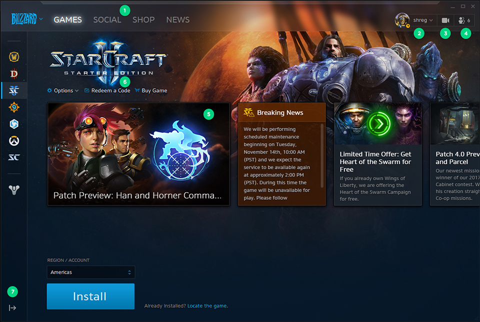
User Menu
This looks like it should open chat, but it doesn't.
Stream Icon
This looks like it turns on video chat; it doesn't look like a streaming icon. Also it seems odd Blizzard only allows Facebook streaming; I think most gamers stream through Twitch or Youtube. I've even seen Blizzard staff on Twitch.
Chat Icon
There are many flaws with the chat but the biggest one is the way incoming messages are handled: its difficult to access missed messages, and the notifications for such are so minuscule they usually go unnoticed. Also, this icon doesn't look like a chat icon.